tirsdag 31. mai 2011

Trap Light

This pendant lamp is called Trap Light and it is designed by Eidhoven-based designers Gionata Gatto and Mike Thompson. The project takes a radical new approach to lighting design through the use of photoluminescent pigments to capture escaping light; and conventing waste energy back into visible light. "Photoluminescence is a process in which energy absorbed by a substance is gradually released as light, and using the Murano glass blowing technique, the designers were able to embed photoluminescent pigments into the glass body of the lamp." is how the website describes the function of the lamp. 
What is really special about this lamp, is the unique and innovative function of it. Through the process the Trap Light becomes both shade and light source, emitting, absorbing and re-emitting the light. With just thirty minutes "charge" of recycled light from a traditional incandescent or LED light bulb and the lamp will provide up to eight hours of lighting. This is just amazing, as well as beautiful to look at! The different tones of light in blue and white gives a pretty glow, and the design and structure in it self is also an eye-cather... Even though it's not a huge secret that the function is the biggest attraction to the Trap Light. 
If you want to read more about the Trap Light or the designer, you have to www.traplightsaveenergy.com.

The Green Hanger

This is The Green Hanger, and it is made in Australia from 100% recycled cardboard. The hanger is an eco coat hanger that is fully recyclable and biodegradable, and is made only from recycled materials. If the plusses for eco-points isn't convincing enough, this hanger is very thin and makes it easy to stack and store. Your clothes will not tangle on this, and the hanger can hold 4kg across the shoulder of the hanger. It also comes in kids-sizes as well as adult. If you would like to read more about this Green Hanger or read more facts (before you decide if this can replace your old plastic/wooden ones) you have to visit www.greenhanger.com.au

Virtue of Blue

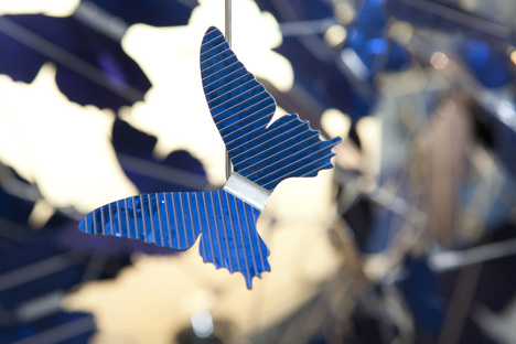
This amazing chandelier is called the Virtue of Blue and is designed by Jeroen Verhoeven for dutch design house Demakersvan. This chandelier is covered with 502 blue butterflies, which are made in the shape of 4 different breeds. These butterflies are not only pretty to look at, they are also the energy source of this whole lamp. The butterflies are actually made out of sapphire-blue solar panel cells, and the piece is self-sustaining as it absorbs the energy of daylight to fuel its own illumination. 
This chandelier is not only pretty to look at, but also very eco-friendly and smart. The fact that the butterflies are made out of solar-panels are very cleaver and two different ways: It saves the environment and it gives the butterflies a glittery look and absorbs more light. I like how the shape of the chandelier is abstract and very organized at the same time. The different shapes of the butterflies makes the butterflies look like they are actually flying around like they would in reality. The Virtue of Blue is a smart design, a beautiful design and a very innovative design with a function we will see more of in the near future. 
If you think this chandelier is beautiful too, or want to see other products from the designer, you have to visit www.demakersvan.com

mandag 30. mai 2011

Serpent

This is the Sperpent shelving and it was designed by Bashko Trybek in 2011. What is special about this shelving system is that is is a modular system in which the user can choose the dimensions of the shelf and adjust them according to his or her needs. The shelf allows to combine and arrange the shelves to fit various interiors and spaces. The structure is plain and makes the product sustainable and easy to recycle.
What I like about this shelving system is obviously its great function and its abilities. The fact that you can change the dimensions and the appearance of the shelf as you like. The colors of the wires and the natural wood on the actual shelfs go great together and make the shelving look visually stunning in addition to the genius function. This shelf is bright, colorful and beautiful and a great piece of furniture for the indecisive person who likes to change their home a lot. 
If you would like to read more about this design or the designers, you have to visit www.bashko-trybek.com.

Peachy.

I found this picture of a beautiful kitchen in a very scandinavian style interior-vise. The peachy tones on the chairs and on the decoration is so pretty, that I thought I would show it to you. Peach is a color that has long been forgotten about, but is now back both in the fashion scene and in our homes and stores. I personally love this color, and I love it when people dare to use bold colors in their homes. Why not choose a colored kitchen accessory instead of black, white or silver? Start with the small things, and see what a difference a little color makes! 

Di Corte

This series of chairs are called Di Corte, and they are designed by Andrea Magnani, Giovanni Delvecchio and Elisabetta Amatori from Resign. The name Resign actually comes from Re Sign or the Re-use of sings, a creative re-combination of signs embedded in wasted objects and re-use of materials. And as you can see, these chairs look like they are going back to their roots (literally). Each piece is unique, but the main idea of the design always stays the same. 
I think this design is very cleaver, and the obvious thing that makes these chairs special are that a part of them are covered in bark. Resign design studio focuses on the re-use of different materials, and I like that these chairs symbolize that the material used for these chairs once was a beautiful, large tree. This chair collection really brings you back to nature, and it gives you a piece of the natural look of the wood used for your furniture. 
If you like these chairs or want to read more about the designers and their projects, you have to visit www.resign.it.

Cork Peg

These small and practical pegs are designed by Canadian design studio Molo Design, and they are called the Cork Pegs. The pegs come with a magnetic mounting system, that makes it easier to mount from the wall. Cork Peg is a simple display and storage solution, that can be a great asset to your home, your garage or your work-place. You can hang anything you want on the Cork Peg, wether it is a sweater, small tools or supplies or bags, as long as it doesn't weigh more than 2,2kg. 
As you can see from the pictures, you can hang what ever you want from the Cork Pegs, and they are really practical in use and also visually interesting. Imagine using an entire wall for the Cork Pegs, and decorating by hanging your favorite stuff on the wall? I think that would be a total eye-cather and a great way to "store" your things. The design of the peg is very simple and clean, but that is a good thing so that you can have many of them on your wall, without it looking cluttered and messy. Imagine if the peg looked "too much" without anything hanging from them? That wouldn't be a well-functioning peg...
If you like the Cork Pegs and want to read more about them or the designers, you have to visit www.molodesign.com.

Large Frame Light Cluster

This wonderful chandelier is the Large Frame Light Cluster and it is designed by Iacoli & McAllister. This lamp is actually just a grouping of their previous lamp "Frame" that is put into jumbled clusters. You can get it in clusters of eleven, seven or two, and you can get it in the colors black, white, aqua, yellow, tomato and tan. And no worries everyone, they ship anywhere!
I actually really like this lamp, and there is something very appealing about it, to me. I don't know if it is the asymmetric shape, the random grouping of different sized frames or the bright and popping colors you can choose from... Either way, I like it! If you like it too, or want to see or read more about the designers, you have to visit www.iacolimcallister.com

fredag 27. mai 2011

New Furniture Landskape

These tables are the New Furniture Landscape for Queen of Hoxton designed by Shai Akram and Andrew Haythornthwait from OKAY Studio Collective. They have designed and installed a new panorama of furniture at The Queen of Hoxton in London. Each of the tables legs have padded heat shrink 'socks' protecting them from the wear and tear they will face tables come in various shapes, heights and sizes to accommodate the various activities that occur in the bar setting.
I think these tables are very great, and I like that the designers have made a whole installation around them. The different colored bottom of the table-legs are great, and I like that each table has different shapes and sizes. They kind of remind me of a carpenter-bench, and I like when design can remind me of something familiar. I also like the visual bolts that hold the tables together. Rough and basic, but still pretty and visually stunning. 
If you want to read more about these tables or the designer, you have to visit either www.okaystudio.org or www.thequeenofhoxton.co.uk.

Writable

This is the Writable coffee table and it is designed by china-born, sweden-based Tianyu Xiao. The Writable coffee table incorporates flippable chalkboard tables into its surface, permitting the furniture to be used at any moment as both a table and a communication tool. Chalk is always available because of its built directly into the panels, and is ready for access.
"How can a piece of furniture make people more communicative? Writable is a unique table that allows messages to be easily written onto table surface. It creates a new way of communicating and enhances the relationship between people in real life, offering possibilities for different kind of people to use it in a way that suits them; especially those who are not good at communicating with other people face to face. Meanwhile, the marks and doodles can be seen as a symbol of their particular lives." is how the designer describes the table.
I really like this table, and I really like everything about it. The special details such as the built in chalkboard makes the table really stand out. Though the structure, the wood and the whole look of the table is beautiful in its self, its undeniable that the multi-function of it is the icing on the top! I don't know how many people would have a lot of random writing on their coffee table, but for those who would, the Writable is just perfect! And plus, from a design point-of-view the table is genius. 
If you would like to read more about the Writable or the designer, you have to visit www.tianyuxiao.com.

Furo

This is the Furo and it is designed by Fernando Brizio for Materia. This is an object that really does not have an important function, but a fun one! It makes a beautiful pattern with colored pencils, and it is a great crayon-holder that looks really good. It explores the idea of a main cork centerpiece whose purpose and function is enhanced through the use of legs. Furo is made out of agglomerated cork and you need colored pencils to use it. The measurements are 255mm x 286mm. 
For more than a year ago the portuguese cork manufacturing company Amorim approached Experimentadesign for a collaboration in designing a product. They wanted to make something to bridge the gap between the raw natural material and user, by creating objects for everyday use. The companies chose ten portuguese and international designers and studios based on their creative processes, playing close attention to their functionally and relevance. It was first presented to the public on the occasion of Milan Design week 2011. 
If you would like to read or see more about Furo or the designer, you have to visit either www.materia.se or www.fernandobrizio.com.

torsdag 26. mai 2011

Cloud

This smart puff-like object is called Cloud and is designed by UK-based Duncan Shotton. Cloud is actually a key-holder that easily fastens to the wall. Embedded magnets secure two sets of keys beneath the cloud to represent falling rain. Each cloud measures 97mm across and can hold items up to 220g. You can only get them casted in matte white jesmonite, so that the cloud can resemble a real-life cloud as much as possible. 
The cloud comes in this cool little box and is ready to be hung on the wall and holding your keys for you. This is a smart object that has an important purpose, and highly decorative at the same time. I would like to have this in my hallway, and its a lot cooler than an ordinary key-holder or a bench to put them on... It is simple, minimalistic and familiar, and I really like the idea of the keys representing the rain falling from the clouds. 
If you would like to read or see more of the Cloud key-hanger or the designer, you have to visit www.dshott.co.uk

Bike Shelf

This bike hanging on the wall is actually a shelf and it is called Bike Shelf and is designed by Chris Brigham for Knife and Saw. The San Francisco-based designer got the inspiration for this shelf after visiting several friends living in small spaces in New York. He noticed that their bikes were always in the way, in the hall or leaning against another piece of furniture. Chris Brigham realized that there were no intelligent solutions to the problem.
This shelf is made out of solid walnut or ash and is suspended from a square steel rod mount. The Bike Shelf management system provides a compact storage solution for bicycles while its flat top surface acts as a shelf for keys, books or bike accessories. I think this idea is so genius, and a great solution to a problem that a lot of people have. Why not find something that looks great and is functional at the same time? (A specially if you own a cool, yellow bike that you wouldn't mind hanging on your wall...)

If you want to see more or read more about the Bike Shelf or the designer, you have to visit www.knifeandsaw.wordpress.com.

Cream chair for Calligaris

This colorful beauties are the Cream Chairs and they are designed by Mr. Smith Studio for Italian manufacturer Calligaris. These chairs are inspired by the popular summer treat; creamsicles! The design aims to build a bridge between wood and plastics with the whole project playing around the connection between the chosen materials. The seat and back of the chair are composed of restilon, a thermoplastic polymer which is mounted into a natural wooden structure.
I like these chair a lot, and I love the colors the designers have chosen on the plastic seats and backrests. The light wood is a beautiful compliment to the colors, and I just get a good vibe looking at the chairs. The Cream chair would be perfect for a dining room setting, a kitchen table or as a side chair, and i would certainly brighten up any room. You could choose to have the chairs in the same color or be daring an use different ones. What ever you would choose, I'm sure it would look great with these good looking chairs!
If you would like to see more of the Creme Chairs or the design studio, you have to visit www.mrsmith.it.
Related Posts Plugin for WordPress, Blogger...